
2019年1月4日 カテゴリー:1章 パソコン操作全般に関わる テクニックとヒントなどを。
明朝体とゴシック体
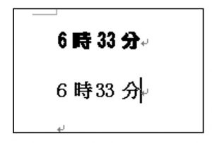
「はね」や「払い」があるのが「明朝(みんちょう)体」、すべてが同じ太さの線で構成されるのが「ゴシック体」です。
● 明朝体
印刷物の本文などで利用されることが多く、印刷を前提とした文書ではよく使われます。
● ゴシック体
ゴシック体はパソコンの画面表示用、印刷物の場合はアクセントとして用いることが多いようです。
私の経験上、作成したドキュメントをファクシミリで送信する場合には、ゴシック体はやや不向きのようです。なぜなら、ファクシミリで受信したドキュメントは多少不鮮明になり、が、文字が判読できずに困ることがあります。その際、ゴシック体の文字は特に線の間の空間がつぶれてしまうことがあります。明朝体の方が線に強弱メリハリがあるので、比較的判読できるようです。
特に、「3」「6」「8」「0」などには注意が必要です。