
2019年1月4日 カテゴリー:1章 パソコン操作全般に関わる テクニックとヒントなどを。
読みやすいものを
さて、いずれのドキュメントを作成する場合も、気をつけなければいけないのは作るほうの自己満足的な書類になってはいけないということです。ありがちなのが、いろいろな機能を使いすぎて、何を伝えたいのかわからない書類です。
読みたい、見たいと思われるドキュメントは、読みやすい文字、正確に伝わる文字を使うことが大事です。
私たちが、本を読もうとするとき、(個人差はありますが)あまり細かい文字だと読みにくいなあ、とか、行間が詰まっていると読みづらいなあ、とか、1行が長いと読みにくいなあと感じることが多いと思います。
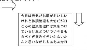
次の文面を比較してどちらが読みたくなるか考えてみましょう。これらは同じ文面ですが、文字の種類と行間、1行あたりの長さを変えています。ちなみに文字サイズ(フォントサイズ)は同じです。
例文A 文字列を横に(右から左に読むか)、縦に(上から下へ)読むか、迷いやすい
例文B あきらかに横に読む形態
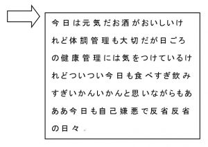
例文Bの方が、見易くしてあります。
これからの章では、フォントや間隔などの設定について、ご紹介していきます。